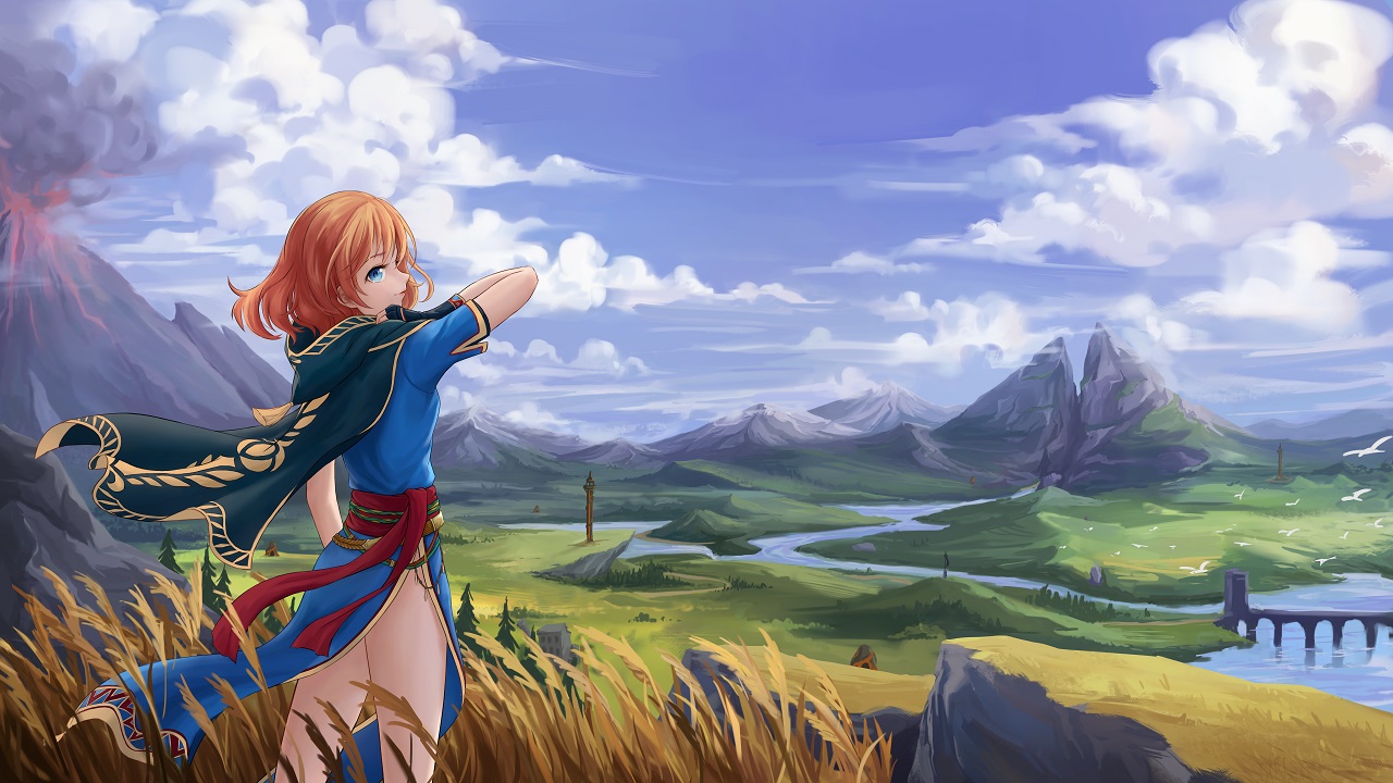
After a month of work, the new-look DigitallyDownloaded.net is finally live, and we are absolutely thrilled with how it has turned out. I’m sure you’re all going to love a cleaner, prettier, more functional and more interesting website too. It makes our reviews and features really pop!
This was the most requested thing (by far) from the reader’s survey that we ran earlier in the year, so it was well and truly past time to do it. I can’t thank the web development team enough for working so hard on such a mammoth project for their work over the last month. Most website projects involve a few dozen pages. With all the links, tags, articles and so on we have on DDNet, our team needed to port 40,000 links across! I’ll be buying them many rounds of drinks after they all get some well-deserved sleep.
So, some housekeeping – the site should be quite straightforward and easy to navigate around, and all the previous articles that we wrote should be on here. I can’t guarantee that legacy content will be presented perfectly – there are likely small formatting issues and the like that have come with the port, and with 12,000 articles across DDNet’s history, making them all look perfect was never going to happen. However! They should all still be readable, and going forward, of course, all new articles will be written for this specific site.
If you do come across any serious bugs that you want to flag with us, do let me know! Obviously, we’ve tested the site thoroughly, but who knows if little issues have snuck in under the radar.
Virtually nothing changes about your experience of the site, with the one exception of the comments system. Because I’m committed to keeping this site entirely ad-free going forward, and because Disqus costs a lot of money if you want the ad-free version, for now I’m leaving Disqus off the site. I know a number of regular readers have been using Disqus here for quite some time, and I am sorry about any inconvenience with the change there, but I do think we’ve got a clean comments system here and I look forward to interacting with you on it!
And that’s it! Enjoy the new site and do let us know what you think of it. After seven years with the old DigitallyDownloaded.net (SEVEN YEARS!), this is a big and bright step forward and we wouldn’t have gone all-out as we have here if we didn’t have the best readers and support.


Looks beautiful, Matt. Congrats to you and your team.
Thank you, Ben. I’m glad we’ve been able to do this for the readers. God knows, you put up with enough of my crap, the least I could do is make the reading experience more pleasant :D.
Now that the Web’s been around for a few decades, I’ve been through my share of revamped sites. Most times, I found them to be less intuitive than the former iterations. Not so here – this revamp is a beauty!! 👍🏼 😸 Kudos to all involved!! 👏🏼
Thank you very much! We wanted to do this right 😀
I like the clean look, but as far as usability on mobile goes, so far my experience makes me not want to know visit the site.
It’s all organized by section, and I see no option to see all of the most recent articles together (I looked a few towns for it). I don’t want to visit each section to see if there’s something new each time, so the organization is a major negative for me.
I don’t mean to be a downer, but I would assume honets feedback is what you guys want.
Indeed, honest feedback is good!
On mobile, “new articles” is located beneath “reviews” and “videos” from the main page – you’ll see it if you continue to scroll down from the main page. We’ve got it organised that way to put the most important things we do at the top, but we’ll continue to look to refine it to provide the best experience we can.
New site looks fantastic, and wishing you the best of luck as you and the staff transition to the new look!
One piece of feedback I’d have: maybe it would be better to raise the “LATEST” section up to the top of the home page, above “REVIEWS”, “VIDEOS”, “INTERVIEWS”? As a regular reader who checks the site every couple of days, I always click over to “latest” to see what’s new since my last visit. Then again, I’m a regular reader and happy to scroll down: maybe if you want the home page to be friendly/interesting to new visitors, keeping “reviews” and “videos” at the top might be best…
Many thanks for the feedback. We will continue to refine the main page, so we’ll see what we can do there :-).
Long lives DigitallyDownloaded.net 🙂
Thank you very kindly ^_^
Absolutely loving this revamp (though I haven’t tried it on mobile). It was desperately needed if I’m honest (whoever thought white headlines on white backgrounds was a good idea on the old site was, er, wrong) but the new look is genuinely great.
Yes, we were very limited in what we could do with the old site, but now… no such problems :D. Glad you like it!
The new site looks amazing, I like the big splash on each article and the start reading button experience.
That was something that I really liked about this design as well. Glad it stands out and thank you for the kind words! 🙂