DDNet Game of the Year Awards 2021! Best Visual Design

////
8 mins read

It’s that time of year again, everyone, where we celebrate the best games of the year. Despite being a heavily disrupted year thanks to the ongoing impact of COVID-19, 2021 produced some incredible games, almost from day one, and as a result, our awards this year has the most variety of games ever – almost 50 different titles got at least one award, and as you’ll see as we announce each category, it really is an endless stream of incredible experiences.

This year we had a special, expanded judging panel, with the entire DDNet team participating, but we also invited some prominent people from independent game publications outside the Website to participate, so we could get a broader range of insights and thoughts into the winners from each category. Our additional judges this year included Pete Davison from Rice Digital, Thomas Knight of Nook Gaming, Robert Allen of Tech-Gaming, Matt Ryan from Shindig, and academic and freelancer, @TsuChanJohnson on Twitter. The total judging pool for the awards was ten people this year around, and there was some heated discussion about the worthiest titles in each category indeed!

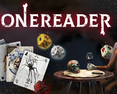
It is almost too obvious to say, but visual design is important in video games. They are a visual medium, after all. At DDNet, we’re not necessarily concerned with the technical details – we don’t need our games to be AAA-blockbusters to consider them to have “good graphics”, but what does matter to us a great deal is art direction. We like to see games that look different, catch the eye, and surprise and delight us from the start of the game right through to the end.

Bronze

Genesis Noir
Noir is a spectacular aesthetic when it’s done well, but far too often “noir” these days means “violent and ugly.” Noir at its best should be classy and stylish, with the high-contrast aesthetics being symbolic of the darkness and seediness sitting underneath. Genesis Noir is brilliant because it gets right to the heart of what noir should look and feel like.

The game drew some criticism for not being gamey enough, which is unfortunate, since it was never aiming to be “gamey.” However, of much greater importance for this particular category award is that no one, ever, could criticise the visual direction of Genesis Noir. It’s subtle in the way that it uses colour and high contrast black-and-whites to carefully draw the eye and focus the player on the relevant information within a scene. The way that the noir aesthetics have been tuned to a story of the universe’s creation (and potentially destruction) is also truly fascinating to see in motion. Not many noir texts do that.
Cris Tales

A Columbian homage to and celebration of the JRPGs of yesteryear, Cris Tales is immediately striking and, despite being a reasonably long game, it’s also one you’ll never get sick of looking at. The central gameplay gimmick is also its most impressive visual feature, too. The screen is split into a number of parts, each displaying a different time (current/future). In other words, you can see the before AND after of key events on the screen, and moving around to see those transitions is always a stunning effect.

The art direction beyond that is gorgeous, too, offering a blend of South American and traditional JRPG aesthetics that results in something you’ve never quite seen before. The colourful, vibrant world design leaves the impression of the most beautiful kind of pop-up book. The character design is distinctive and memorable. The environments are all a wonderful twist on classic fairy tales and JRPG tradition. The whole thing is unique because of its background and that makes it special.
Silver

Cupid Parasite
You’re going to love Cupid Parasite from the second that you load it up. This otome game is full of energy and verve, and the art deco aesthetics that come with it are sublime. With any visual novel, the art itself is a key selling point, but Cupid Parasite is another level again. This is a treat for the eyes at every step of the way.
The character art is exceptional, too. Of course, with any otome game, the boys need to be a pretty and varied bunch, and that’s certainly the case with Cupid Parasite, but what is interesting about this game is that it’s more solely focused on the comedy than most of its peers, and that comes through the character designs themselves. There’s a silly, self-aware edge to the art of Cupid Parasite, is the point here, and that helps make it stand out in a genre when we’re starting to see a lot of games localised. 
Gold

Blue Reflection: Second Light
What can we say about Blue Reflection: Second Light’s art that we haven’t yet? This game is the ultimate example of what we mean when we say we’d rather art direction over raw processing and big-budget effects. Who knows what frame rate Blue Reflection runs at? It’s perfectly playable and technically proficient. More than that, though, it is absolutely breathtaking to look at. Mel Kishida’s character designs and the airy background and locations make for something that is ethereal in its beauty, and that’s something we rarely see.

Will a lot of people chalk this game up as “fan service?” Probably. And it has an element of that. But more importantly, it’s like a painting in motion, and a unique artistic talent realised to the point that the game itself is unique. Blue Reflection: Second Light would have been an excellent game if it wasn’t so beautiful. But, at the same time, it wouldn’t have been so emotionally engaging and uplifting. 

This is the bio under which all legacy DigitallyDownloaded.net articles are published (as in the 12,000-odd, before we moved to the new Website and platform). This is not a member of the DDNet Team. Please see the article's text for byline attribution.

Previous Story

The Lord of the Rings films have turned 20… remember when the games were good?

Next Story

IN VIDEO: DDNet GOTY 2021: Best Visual Direction Award

Latest Articles

>